MyBoeing Notifications

Create a unified platform for employees to manage and receive notifications from various entities within the company.

Project Type: New Feature – Web App

My Role: UI/UX Designer

Client: Boeing Corporate Communications and Boeing Global Communications departments, responsible for internal communications.

Target Users: Boeing employees and their managers, streamlining action item notifications.


Client’s Goals: Reduce overwhelming emails and expedite employee action on notifications.

Challenges: Integrating data from 12 different sources with varying structures and requirements posed the primary challenge, resulting in complex integration.

Key Takeaways: Consistency in functionality implementation is essential; useful features should not be implemented if they lack consistency. Inconsistent tracking of notifications based on data sources can confuse users.

The Process

1. Research

Investigating user needs and notification sources, identifying challenges, and potential solutions for the new application feature.

2. Product Strategy & Solutioning

Collaborating with diverse team members to define the problems are users are facing and that aligns with business need to create the best product solutions possible.

3. Feature Prioritization

Determining key application features based on user needs and data source integration complexities.

4. Wireframes & Prototype

Creating initial application designs emphasizing user experience and intuitive feature navigation.
-

5. Usability Tests & Functional Specifications

Fine-tuning the initial designs into detailed, user-friendly interfaces that align with the product strategy and user feedback.

6. Development & Design QA

Building and testing the application for issues, ensuring it meets requirements and provides a seamless user experience and meets first time quality.

7. Launch

Deploying the feature, and celebrating a job well done!

8. Continuous Feedback

Collecting user feedback, and identifying areas for further enhancements.

Problem Statement

Overwhelmed by high volumes of daily emails, Boeing employees struggle to manage and respond to vital notifications in a timely manner, while entities face overhead from issuing reminders. This inefficiency risks delaying actions and overlooking crucial tasks. There’s an urgent need for a user-friendly system to streamline notification management and prompt immediate action.

1. Research

Boeing stakeholders approached us first for this enhancement to  MyBoeing Notifications and it immediately prompting the team to plan for a comprehensive user understanding.

User Interviews: with diverse user groups to understand their interactions with email notifications.

Field Studies: were used to observe user behaviors during their workday, focusing on their response to notifications.

Competitive Analysis: was also carried out to understand notification management best practices and challenges.

2. Product Strategy and Solutioning

We utilized a virtual whiteboard tool for our “How Might We” questions to facilitate collaborative brainstorming, allowing our team to interactively generate and refine solutions to user-identified problems in real time.

Research Takeaways and Learnings

  • Boeing sends diverse and frequent action items, causing challenges for managers and VPs who must prioritize among a high volume of notifications.
  • Flightline employees sharing computers often miss critical notifications, impacting operations.
  • Users across roles seek a streamlined, customizable notification system for efficient task management.
  • Customization in notification types, frequency, and channels is crucial for success.
  • Clear, concise, and personalized notifications with context enhance user engagement and satisfaction.

3. Feature Prioritization 

After refining and voting on ideas, we used perceptual mapping to identify innovative, low-effort solutions for the initial product release. These were primarily in the bottom right corner of our map. Our Product Owner translated these into backlog stories, prioritizing them based on our mapping exercise.

User Flow

  • User Flow: Users started with the notification bell, leading to the feed with notification cards containing specific actions. A dashboard stored all notifications, including archived ones, for easy access to historical data.
  • Help Modal: Designed for first-time users or those needing assistance, the help modal provided immediate support and initiated a tutorial.
  • Design Focus: Prioritized ease of use, intuitive navigation, and efficient information presentation for a seamless user experience.

4. Low-Fi Wireframes

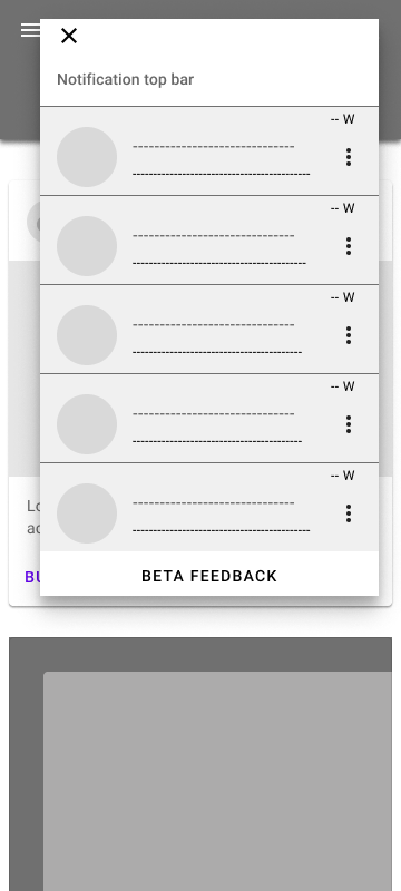
Design Phase: After ideation, I adopted a mobile-first approach for wireframing.

Process: Started with low-fidelity paper sketches, transferred to Figma for mobile layouts, and later developed tablet and desktop designs.

Stakeholder Input: Presented initial wireframes to the product team and stakeholders for feedback, refining designs for alignment with project goals.

High-Fi Wireframes and Prototyping

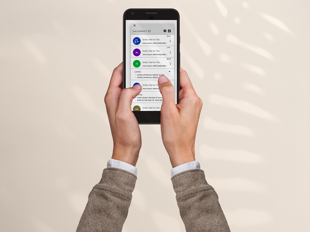
High-Fidelity Mockups: Incorporated feedback, created high-fidelity mockups starting with mobile and scaling up.

Developer Review: Initiated a review with developers to address potential design constraints.

Interactive Prototype: Created a fully interactive prototype to showcase functionality, aiding discussions with stakeholders and the development team in the transition from design to development.

5. Usability Testing

Usability Testing Preparation: Prepared for usability testing by documenting uncertainties, A/B testing areas, and scripting user actions.

Participant Recruitment: Collaborated with the Product Manager to recruit a diverse group of participants, from executives to flight operative technicians.

Usability Testing: Conducted tests, recorded findings in FigJam, and used insights to streamline and optimize the design, improving user experience and functionality.

Takeaways: Identified issues with inconsistent with dismissal notification behavior and overlooked ‘Archive’ section due to subdued design.

Refinement and Functional Specifications

Post-Usability Testing: Led ideation sessions to address design challenges and updated the interactive prototype based on user feedback.

Developer Handoff: Provided developers with comprehensive functional specifications, ensuring smooth design-to-development transition and preserving design fidelity.

Key Changes:

  • Standardized notifications by removing auto-dismissal for consistency.
  • Relocated ‘Archive’ to a distinct tab for better visibility and engagement.

6. Development and Design QA

During the “Development and Design QA” phase, my involvement was more consultative. I was available to answer developer queries, assist in the creation of user stories, and provide additional guidance as needed. Once the developers completed their work, I conducted a “Design QA” review to ensure the design quality met our established standards.

7. Launch

The new feature Launched on MyBoeing in August 2020, to a certain subset of Beta users, we then subsequently released to more Beta users, and then eventually to the public.

8. Continuous Feedback

Post-Launch Feedback: Introduced a ‘Beta Feedback Button’ for direct feedback from beta users, prioritizing insights for tool refinement.

Usability Testing: Committed to ongoing usability testing to remain responsive to user needs, fostering continuous tool improvement with a user-centric focus.