Performance and Training Advisor Chart Style Guide

Comprehensive documentation to outline how and when a chart should be implemented.

My Role: Lead UX Designer, Process Development

Users: Portfolio Designers and Developers

Project Summary: Created a style guide to standardize the use of Power BI charts, ensuring consistent application across data displays for both end users and the design and development teams.
Challenges: Differing opinions among developers on chart implementation, requiring collaboration to reach consensus. A backlog of updates was created to address inconsistencies and ensure adherence to the style guide.

Key Takeaways: Once adopted, consistency in chart application improved significantly, and disagreements about chart usage were eliminated. Any questions or uncertainties were added to a backlog to be addressed later, ensuring consistent updates across the entire application.

The Process

1. Assess and Plan

Determine scope, and tackle the backlog of updating an application

2. When to Use

Documented when to use certain charts for implementation

3. How to Use

Documented the context for how to use charts for implementation

4. Maintenance

Maintain backlog stories to update style guide as needed.

1. Assess and Plan

Research and Best Practices: Researched best practices from sources like the Nielsen Norman Group, UX Magazine, and Google Material Design to establish guidelines for when specific charts should be implemented effectively.

Application Audit and Review: Conducted a detailed audit of the application to identify chart usage, inconsistencies, and incorrect implementations. Reviewed findings with the PM and PO to confirm alignment on the issues and build a foundation for consistent charting standards.

2. When to Use

Linking to Examples and Components

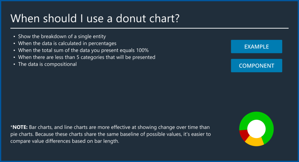
  • In-App Chart Examples: Each chart style guide page included links to where the chart was correctly implemented within the Performance Training Advisor (PTA) application. This provided designers and developers with clear, real-world references for consistent application.
  • Design System Integration: Links to the chart components in the design system were also included, enabling both designers and developers to reference the correct specifications before beginning design or implementation work.

Guidance

  • Data-Driven Decisions: The “When to Use” section of each style guide page encouraged users to make decisions based on the data they were designing with, ensuring charts were selected and applied in a way that best communicated the insights.
  • Clarity in Chart Selection: The guidance emphasized how different types of data—comparisons, trends, or distributions—mapped to specific chart types, helping users choose the most effective visualization for their needs.

3. How to Use

Component Display: Included detailed instructions on how to properly display certain components alongside the chart, specifying any required Figma variables to be selected for accurate representation.

Text and Writing Standards: Outlined specific content requirements, such as the type of text and labels to be used with each chart, ensuring clarity and consistency in communication.

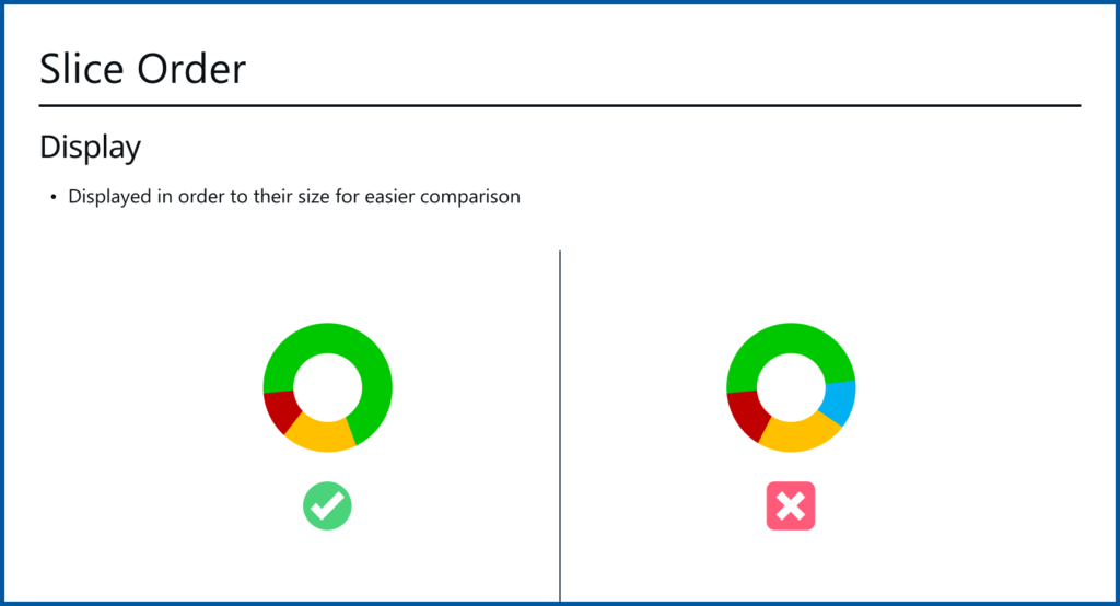
Correct Usage: Each chart style included a visual example of how the chart should be displayed, providing a clear reference for proper implementation.

Incorrect Usage: Included a contrasting example of how the chart should not be displayed, helping to prevent common errors and reinforce best practices.

4. Maintenance

In design triage meetings (see Design System case study for context), style guide updates were assessed for complexity, added to the backlog with PO support if they required design or development work, and communicated during sprint demo meetings to ensure team alignment.